Meeting with Pádraig 3 Feb 2011

February 7th, 2011 2 comments

Discussed results so far – I feel that the dataset does not include enough data to give reliable information about location. We discussed other datasets, perhaps using cabspotting and geolife.

Padriag re-iterated his skepticism about using location; that all the information needed is in contact information, and therefore location data is redundant. we suggested the idea of testing LBR on the cabspotting dataset, over short periods of time, because cabs are highly mobile, they come into contact with each other more often.

Pádraig suggested that we could start looking more at communities, and continuing on from Bubble RAP, so we could then use synthetic networks. It would mean a bit of a change of track however.

I said I would try to get Bubble Rap running in the simulator, then try to run it using MOSES or GCE to determine the communities, rather than the default method. GCE has a heirarchical clustering mechanism, which would suit Bubble Rap.

I also said I would try to use the Social Sensing data to see how it performs.

Pádraig suggested again that we could follow on from what Pan Hui did, and testing highly overlapping communities, and use some of the groups community finding algorithms. This would fit better with the groups work, and therefore would be a bit easier to link in.

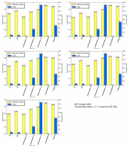
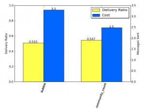
With Bubble added the results for MIT-OCT are show below – note that the communities used for this run, were pre-generated by Graham.  I haven’t yet  found out how he generated them.

Results with Bubble included

Results with Bubble included

Bubble routing seems to calculate Communities using k-clique clustering and weighted network analysis.

Last minute update: I generated data for use in the simulator based on MOSES communities (based on contacts between nodes). Instead of using Hui Betweenness for ranking, I simple used the number of communties a node is a member of, as the rank value, just for initial testing (of script output).  It yielded a better result than regular Bubble, with the caveat that the bubble communities are based on a start date 1 week into the period, and I need to double check that the MOSES one also does this.

moses-vs-hui-rank-with-caveats

Regular Bubble routing vs Bubble MOSES Communities with Community Rank

Categories: Uncategorized

Routing to the centre

February 2nd, 2011 2 comments

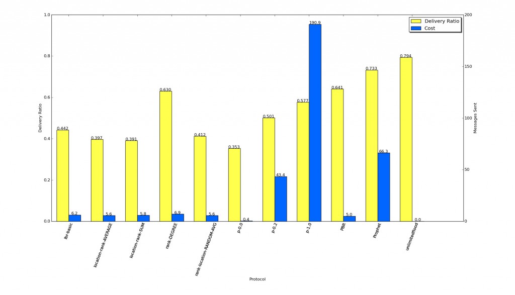
Further to the previous post, I have run some more simulations which include degree rank routing, where individuals are ranked in order based on their degree. I also updated LBR to allow for randomising rank scores, and ran this 25 times to get an idea about the ability for random ranking to deliver messages.

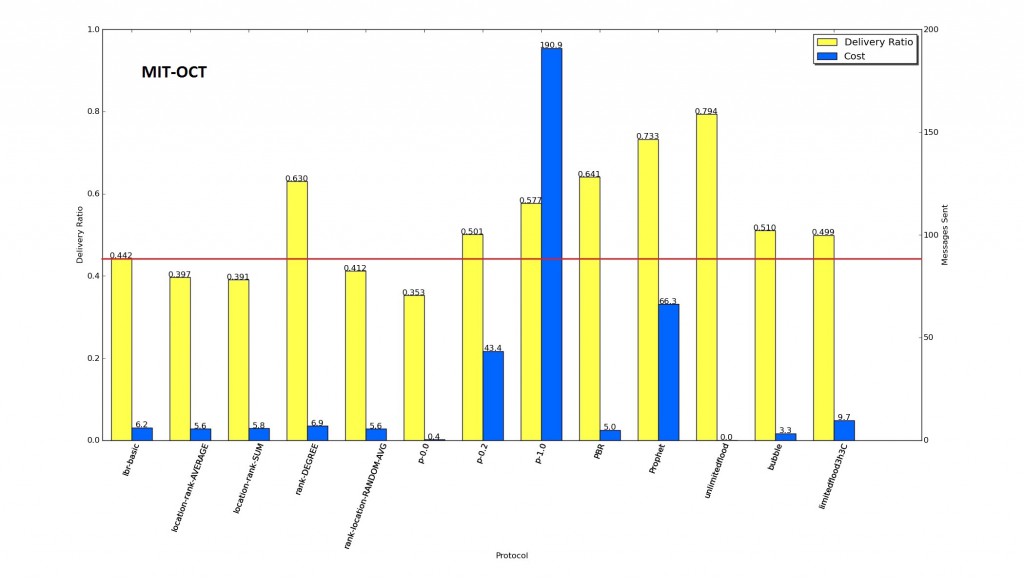
All routing methods shown for comparison.

All routing methods shown for comparison.

Interestingly,  routing based on degree only, gives a good delivery ratio. The average of the RANDOM runs performs slightly better than the more sophisticated LBR schemes, but not quite as good as LBR basic (which is the original ranking based solely on cell towers). This suggests to me that the mechanisms we are using to rank locations are not working, perhaps due to lack of rich enough data. It will be interesting to see how this dataset compares to other datasets.

Some new ideas

February 1st, 2011 2 comments

Met with Pádraig,  results so far are not complete, so we still need to:

  • Run routing based on ranked centrality only (i.e. the aggregate graph of all connections): Graham might have done this already. To give us a more complete picture of what routing towards the centre really looks like.
  • Do more randomised ranking runs, to see of random can come up with better routing rank than LBR.
  • Implement and test new LBR idea.

Next Step for LBR

Pádraig suggested a simple advancement for LBR:

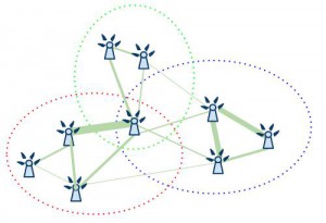
Person A, has a  message for Person C, and has encountered Person B. A has to work out whether to pass the message on or not. Each node has  a probability matrix of visiting all locations at any time.

Probability matrix of nodes being at any given location

A makes his decision by calculating the dot product of his own locations against C’s locations, and comparing that to B’s calculation in relation to C. If the sum for the B.C is greater than A.C then A passes the message to B. The rationale being that when one encounters someone else, who is more likely to visit the same location as the destination person, then the message should be passed on, because they are more likely to see the other person.

There are some caveats….. TODO: buffer zone, future prediction, past history, recent(ness?), limited locations,

Some specific details/ideas/extensions to consider:

  • We need to consider how these probability matrices will evolve over time. A nodes probability matrix will change when he/it visits new places, or alters existing mobility patterns. Initially, we can use the computed data, but more refined versions should exhibit a real-world scenario of unpredictable behaviour.
  • Determine a good threshold to use, so that messages are not sent between people of very similar rank/score, the rationale being that there may not be a benefit in passing it on, and therefore try to reduce overhead.
  • Limit the number of locations considered, to only those that are popular, this might boost the use of popular locations, in an attempt achieve a higher probability of a message being passed on.
  • Consider a more sophisticated mechanism to predict co-location with the destination node, or a better conduit/carrier node, by predicting future interactions with nodes based on past history.
  • It may also be important to show the possibility of real-world application, by implementing  a scheme for automatic dissemination and update of the probability matrix using the network itself. (related to  previous ideas about piggybacking meta-data using network/vector clocks, which themselves can be used as a source of routing metrics. e.g. recentness of contact, latency, update routes/speeds/times etc.)

Pádraig and I discussed the problems we may encounter in regards to peer review and justification of the work; in that the problem area is not well defined, and therefore we might have problems showing why this work is novel, and proving what our contributions are. To that end we need to explore the literature a little more, so we might be able to show a solid justification for the work, or alternatively, change our approach so it fits in better with other, better defined problems.

What sorts of messags are ‘delay tolerant’? Pádraig’s suggestion is that twitter messages, and facebook update messages might be delay tolerant, as a person may not need to receive all messages, and generally only want to get the latest updates, it does not matter if a few are lost along the way.

How do we define the urgency of messages, and the efficiency of the network? Perhaps one type of message can be delivered within 10 time periods, and still be considered to be relevant and within acceptable delivery time, but another message may need to be delivered within 1 time period, to ensure quality of service.

There is a categorisation issue too; where some messages can be considered one-to-one (direct messaging), some one-to-many (twitter update), many to many (local information) and many-to-one (sensor networks). We need to decide which of these we will consider. On this note, I said I would speak to Neil Cowzer, who is working on implicit group messaging, to see what his motivation is, and to see if he has a well defined problem space that he is tackling.

Another alternative that Pádraig suggested, was looking at social science approach, where we look at the heuristic approaches to routing in complex social networks. Pádraig’s suggestion was that on some networks, we might be able to apply certain routing techniques, which do not work on others. The contribution would be defining, categrorising and testing new and existing combinations of network types and routing mechanisms. This would be an interesting route to take, but would mean a step back in my research, as I would need to do reading into this area. This would link up well with the work of Stanley Milgram, Granovetter and Watts & Strogatz etc. So I should re-read some of this work, but more importantly, take a look at the biggest cited, citing documents, to see where research might be heading now.

Picking location clusters

January 21st, 2011 2 comments

AMet with Pádraig to discuss his ideas about location clusters. The idea is to assign a cell tower to a maximum of three clusters or ‘locations’. We would first need to remove the largest N clusters.  The rank of clusters should be defined by the sum of the weight (number of reports of links between towers) of the edges between the node into the cluster, or perhaps the average.

towercommunities

Cell towers are linked to at most their top three communities, ranked on the strength of the ties (weight of edges) to that community.

The first step is to run this community allocation against the whole set,  and see what it looks like. As it might be that we can keep the large clusters.

Once we have this done, we can re-rank the locations using a modified version of the orignal algorithm. In the new version, a location has a score, which is the sum of the number of times a cell towers within it has been reported, this means that some cell towers will affect the score of multiple locations. Once we have the new ranked locations, we can then rank each used based on their visiting these locations.

Location Clusters/Communities

After assigning cells to a maximum of three location clusters based on the AVERAGE edge weight and the SUM of weight (i.e. two seperate configurations), it was possible to visualise the assigned clusters.

The top 3 allocated clusters based on MOSES output for MIT-OCT 2004, where the membership is calculated using the average weight of edges in/out of the cluster.

The top 3 allocated clusters based on MOSES output for MIT-OCT 2004, where the membership is calculated using the average weight of edges in/out of the cluster.

For the initial experiments, the dataset without any communities removed was used as the source for the ranking algorithm. Using only the MIT-OCT dataset as the basis for comparison with other results.

mit-oct-start-top3moses

LocationSim results for MIT-OCT using Top 3 Moses Allocated Communities for LBR based on AVERAGE, SUM weight calculation, vs RANDOM ranking allocation.

For comparison, one run with a random allocation of rankings (i.e. ranking was shuffled randomly, but only for one run, not an average) gives a hint about the improvement that ranking gives for LBR. In this case, there no significant improvement, but for more conclusive results, multiple runs of random rankings would need to be tested. It might be interesting to try to find the best possible ranking in order to improve routing, it could be that there is no better ranking that can be achieved than that of LBR. This would explain the poor performance against the Random protocols, who are not limited to a strict hierarchy. To match Random 1.0 and 0.2, LBR may need to be more sophisticated.

MIT Cell Tower Community Finding

January 19th, 2011 3 comments

Had a meeting with Pádraig; we discussed using MOSES to get the list of communities of cell towers.

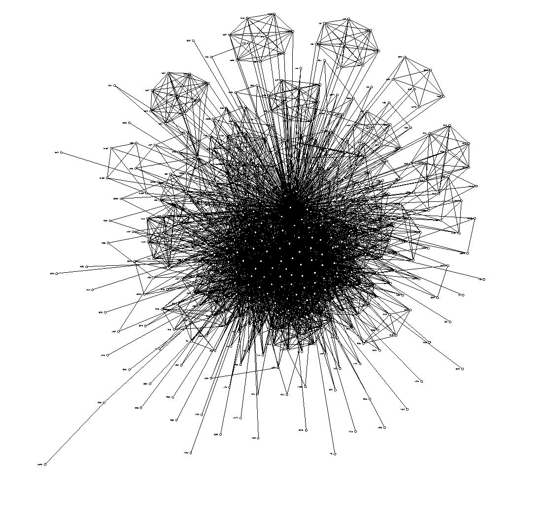
To recap, two cell towers are linked, if during a contact (Bluetooth) between two people, they are spotted by either person. This generates a huge furball of when visualised. I installed MOSES on a server, and ran it on the graph generated from MIT Oct 2004. It produced 66 Communities. There are 468 nodes in the dataset. The average number of communities per node is 2.17.

Padraig suggested visualising the data, and colouring each community in turn, so that we might be able to get an idea about which communities we can remove (as they are too big), and will leave us with smaller subsets of the graph, which identify locations better.

We can then use these communities as the ‘locations’ in location based routing. We need to determine whether it matters if a node report multiple ‘locations’ at the same time.

I started to view the communities colours as suggested, but it still showed a very large furball, so I decided to see what happenned when the highly connected nodes are removed. In the image below, we can see that when the top  100 highly connected nodes are removed, it becomed clear that there are distinct groups of cell towers.
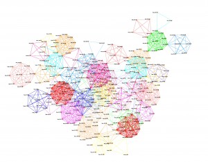
MIT Oct 2004, when two users see each other, the cell towers they see are linked. This version has the top 100 highest connected (degree) nodes removed.

MIT Oct 2004, when two users see each other, the cell towers they see are linked. This version has the top 100 highest connected (degree) nodes removed. Edges show community membership as given by MOSES.

I sent on the moses output, and list edges to Aaron McDaid and Daniel Archambault, who genereated the Euler diagram  below using Tulip.

the layout in the visualization is based solely on the communities found by moses. Tulip attempts to lay out the sets in an Euler diagram such that communities are placed nearby if they share nodes in common.
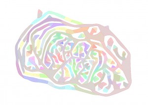
Euler Diagram generated using Tulip from the output of MOSES for cell towers connected in MIT Oct 2004.

Euler Diagram generated using Tulip from the output of MOSES for cell towers connected in MIT Oct 2004.

I have yet to speak to Aaron in more detail about what this diagram means, but if I have interpreted the visualization correctly, the similar coloured areas are collections of nearby nodes; seperated into distinct clusters, rather than overlapping ones. If it is possible to extract this clustering, it might provide exactly the location clustering we need, if we remove the very large clusters (light brown/green).

I took some time to review the way that cell towers are linked, to make sure that it was making a fair linking, ready for when MOSES did it’s thing. As it is, it is a little loose in how it determined whether two cells are linked, as it links all cells that are seen in an entire contact period. This means that cells that are linked when two people are travelling together. I plan to work on a more strict approach, where the duration of the cell sightings for each person are compared, and cells linked only when it is clear that they are at the same time. However, I continued using the results we already have.

The images below show the graphs, when the top N communities are removed. The size of the node relates to the number of times a cell tower is reported, using binning.

The most number of times a node is spotted is 9291, the smallest is 1, so
9291 - 1 / 10 bins = bin size of 929.
For example, if a node is spotted 1043 times, then it will be placed into bin 2.

The width of the edge relates to the number of times an edge is reported between its two vertices, again using binning. The most number of times an edge is spotted is 3676, minimum 1. The average however, is only 8.38, and the median is only 3, so the binning really only distinguishes the very highly seen nodes.

The colour of the edges is related to the community membership. Because nodes can be members of multiple communities, and therefore have multiple edges, I made the decision to create only one edge, and distinguish it using the concatenation of the community names (e.g. Community_0Community4…), so nodes that edges that make up the same communities, will have the same colour. This might not have been the best way to do it, but the software used does not show multiple edges between the same nodes. An alternative would be to make the width of the edge equal to the number of communities it represents.
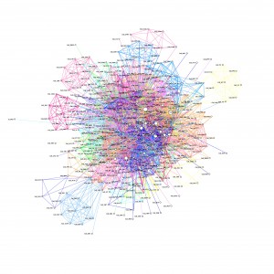
Minus 1 Community
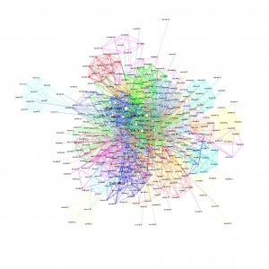
Minus 1 Community

Minus 15 Communities
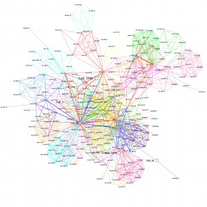
Minus 15 Communities

Minus 30 Communities
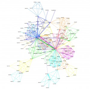
Minus 30 Communities

Minus 40 Communities

Minus 40 Communities

As communities are removed, the graph becomes clearer, where 40 communities are removed, it becomes more obvious that there are distinct communities and the high degree nodes are more obvious.

eps and png files for other numbers removed

The goal is; given any cell tower id, we can identify which community it belongs to, and by extension, the ‘location’ the node is at.

An idea I have for finally making this data usable, so that we have distinct communities. Ignore the top N communities (e.g. 30). Order each community by summed weight of edges, then take the highest degree node, and assign it to the community it belongs to, that has the highest rank, then remove that node from further consideration. Continue until all nodes are assigned to a community. This may need some more thought.
MIT Contacts – Cell Tower stats

December 17th, 2010 2 comments

I processed the contact logs, rather than just the hop logs, and after ~6 hours it completed! Now all contacts in the whole MIT dataset have associated cell towers. If a cell tower could not be found for the contact duration, then a second search was done for a record of a cell tower finishing  in the previous hour. The timestamps are preserved so that they can be excluded later. The following shows the stats for this data, in regards to cell towers.

Row Count:	114046

Both Have Cells:		28804	 (25%)
Neither have cells:		34587	 (30%)
One side has cells:		50655	 (44%)
	From has cells:		30557	 (27%)
	To has cells:		20098	 (18%)
Nodes share cell:		4045	 (4%)
First start time:		Thu, 01 Jan 2004 04:03:17 +0000
Last end time:			Thu, 05 May 2005 03:39:29 +0100

This means that out of 114046 contacts between 01 Jan 2004 and 05 May 2005, only 4045 nodes report at least one cell in common at time of contact, but 28804 report different cells, and a further 50655 report cells for at least one of the nodes. This means, that if we assume that a one sided cell sighting at time of contact determines a cell sighting for both nodes, then we have cell towers for ~73% of  contacts.

The assumption is that if any of the cell towers seen in the contact period, then the nodes are considered to share a cell. However, this can be further refined if needs be, to be more strict, where a contact period is very long.

UPDATE:
Below is a visualisation of the connected cell towers for MIT-Oct 2004, it it very confused and has a huge central mass, but there are clear connections of towers on the periphery. I think this can be further refined to be more strict about cell tower connections (as at the moment, the dataset contains more than 1 cell tower for any given contact period). Also, at the moment it links two cells even when two nodes are on contact for a long period of time, in which they could conceivably be moving together.

hairball-mit-oct-2004-cells

Cell towers where an edge is made when either node in a contact event has seen one of the cell towers.

Meeting

December 16th, 2010 2 comments

Met with Pádraig and Davide, we need to get out of the data cleansing phase, and get into some more interesting areas!

I need to generate the linked cell towers graph based on contacts not just message passing. (as this was what should have been done in the first place!), and use the last known cell tower (within a time limit) as the current cell tower, if none has been seen. This will hopefully mean that we will have cell towers reported for all contacts, and with any luck there should be a larger proportion of contact events that report the same tower.

Using the graph, link the main connected towers into the ranking algorithm.

Categories: Uncategorized

Location and Persistence Based Routing (LPBR) thoughts

December 16th, 2010 2 comments

I think that once we have some robust way of relying upon what a location is, we can start to be a little bit more sophisticated with the routing protocol. i.e. making real-time decisions about routing based on the current history, rather than the broad ranking.

For example, extending the idea in PBR which uses duration of contact, and including the idea of Prophet and various others, which use the time since the last meeting with a node, we can use these for locations, and contacts;

Node A keeps a record of contacts and locations, and interrogates
            other nodes on encounter.
On encountering another node B, pass the message for C:
     if B spends more time than A, at any location that node C does
     or B has visited the destination nodes most popular location(s)
           more recently than A
     or B has seen the destination node more recently than A
          ?(and it has a regular pattern (periodicity) of seeing the destination
           node which can be predicted, and means that B will see C
           sooner than A)?
      or B has spent more time than A, with node C in the past

This effectively pushes the message to to the places that the destination node often visits, and to the nodes that see the destination more often.

In a large network, with many very weakly connected communities, it would be difficult to penetrate the destination communities with messages, however, an enhancement to get messages sent widely is to use some other broadcasting mechanism first, such as spray and wait, where there are a limited copies of a message, of which half are shared at every contact until each node has one copy.

At this point the Spray and wait protocol would hold onto the message waiting to see the destination. However, if we then start LPBR routing from this point, we could find that one or some of those messages are with nodes in the destination community, and therefore a greater likelihood of getting the message to the destination.

Categories: Ideas, projects

Updated plots for Community Structure

December 14th, 2010 2 comments

In the last meeting I had with Pádraig we went through the spectral clustering technique, and discovered that there were some errors in my calculations of the the clusters. I took the time to re-do the community calculations,  and to run the tests again, to make sure all is correct. I used the MIT  dataset, and constrained it to the month of October 2004 (as before). Messages are created and initially sent at the first time step. The selected communities for each week are taken as the biggest group, which in practice were roughly the same set of connected nodes. I chose to omit the nodes with a value of 0.0 in the matrix (V) (see  data pipelines).

Delivery Ratio over time

mit-oct-start-community-lbr-lineplot

This plot shows the delivery ratio over time for MIT-OCT dataset, for LBR communities (where the community is taken from weeks 1, 2, 3, 4 and all 4 weeks), PBR, Prophet, Unlimited Flood and Random(1.0, 0.2, 0.0).

Final Delivery Ratio and Cost

mit-oct-start-community-lbr-barchart

This chart shows delivery ratio and cost for each Protocol, note that unlimited flood does not report cost.


In these updated plots, it is encouraging to see that with the corrected community structure, LBR actually performs well, and in fact for the community structure in week 1, it performs better overall than PBR, with weeks 2, 3, 4, all, close behind. It is also good to see that LBR is beating Random 0.0, and 0.2 consistently. LBR week 1 Community also tracks a small way behind Flooding for a short while around 05/10 – 08/10 which is quite interesting. The communities are listed below (or can be viewed here), for further analysis.

UPDATE:

Having given this a little more thought, this is a little mis-leading, so I have generated new plots where all Protocols are constrained to the same community nodes. Unfortunately, this yields a similar spread of results between the protocols, as did the results that did not consider community structure. Only the structure discovered in week 1 increases the delivery ratio.

Delivery Ratio for each community, for each protocol

mit-oct-communities

This plot shows delivery ratios for each community generated from different weeks and all weeks in Oct 2004 for the MIT Reality Mining dataset

cost-dratio

This shows the final delivery ratios and costs for each protocol, for MIT OCT 2004, communitites

What I plan to do now is to go back to the ranking algorithm, and use the linked cells mechanism to re-calculate the rankings. It might also be useful to start thinking about being able to use the real-time location information (in this case cell towers/linked cell towers) in a routing algorithm directly. This would let us start to implement some simplistic location predictions.

I also created a clearer graph visualisation for the cell tower links, this shows that there is a componant that  encompasses a large percentage of the reported cells overall. If we were to consider this one location, it is possible that it covers a very large area.

connected-cell-towers_new

This shows the cell towers that are connected when at least 100 messages are passed and reported at both cell towers, edges are numbered where this is more than 300.

Cell tower connections based on contact events

December 10th, 2010 2 comments

Using the log of hop events, I was able to generate a list of cell towers being used at the time of the hop, from this I built a list of the cell towers that are linked in this way, with a count of the number of times they had been connected (linked_cell list txt, or linked_cells json version ). From this a created a graph where the weight of the edges is the count.

connected-cell-towersEdges with a weight (or number of times nodes passed a message and reported different cell towers) less than 100 are removed for clarity, the colour of the edges shows the weight of the edge increasing from blue to green.

The tool that I have used to visualise these graphs is called the network workbench, and it reports the following about the graph:

Nodes: 84
Isolated nodes: 9
Node attributes present: label
Edges: 149

No self loops were discovered.
No parallel edges were discovered.
Edge attributes:
Did not detect any nonnumeric attributes
Numeric attributes:
min    max    mean
weight     1    2700    103.42953

This network seems to be valued.

Average total degree: 3.547619047619045
Average in degree: 1.7738095238095228
Average out degree: 1.7738095238095228
This graph is not weakly connected.
There are 14 weakly connected components. (9 isolates)
The largest connected component consists of 67 nodes.
This graph is not strongly connected.
There are 61 strongly connected components.
The largest strongly connected component consists of 24 nodes.

Density (disregarding weights): 0.02137
Additional Densities by Numeric Attribute
densities (weighted against standard max)
weight: 2.21041
densities (weighted against observed max)
weight: 0.00082

connected-cell-towers_circular

Edges are coloured linearly from white to black depending on weight, edges with a weight greater than 300 are labelled.

It seems that there are is a group of towers that are strongly connected, by large number of messages being passed, and nodes reporting them as being the cell towers used. One possible reason for this,  is perhaps because the places where the nodes are, are popular, and as such, require more cell towers to cover the demand. These results are promising, because it means that if we pre-process the data, and ignore connections where there is a low weight, we can use groups of towers to give a notion of place. What this means is, when a node reports a tower in the known cluster of towers, we can assume that it is in roughly the same place as any other node who also reports a tower in the same cluster.